Product Editor Rebuild — Faire Internship

Rebuilding Faire's core product editor and merging its disconnected codebases for the largest engineering velocity win of H2 2024

Internship
May 2024 - August 2024
on-site San Francisco and Toronto
Role
Product Design Intern
in Faire's first product intern cohort
Team
Brand Pillar, Listing Quality Pod
CONTEXT
What is Faire's product editor?

Faire is a wholesale marketplace that connects retailers (buyers) with wholesale brands (sellers), helping them source products at a global scale. The product editor is a core tool that sellers use to list their products on Faire's marketplace by adding important details such as titles, descriptions, images, pricing, inventory, and shipping.

TL;DR

In my first week, I audited the product editor as a part of my onboarding process. After proposing improvements to my PM (Claire Coldberg), a revamp of the product editor became scoped as an H2 2024 priority. I led the design process for phase 1 of the revamp, which included layout changes, error handling improvements, and a new media upload module. This phase shipped in Q3 2024.

I also kick-started an effort to merge the codebases of the apparel and non-apparel versions of the product editor. It will be the largest engineering velocity win for catalog management in 2024, essentially cutting the need for engineering resources on the product editor by half. My product editor work was way beyond an intern's scope and it was the project that earned me an Outstanding co-op rating during my time at Faire, with only 3 or 4 Outstanding ratings given per term to over 30+ interns.

The problem

More than 21% of non-apparel brands and 44% of apparel brands have reported inefficiency with the product editor. Faire’s product editor is suffering from years of design debt. With new features being scoped for H2 2024, it's a worthy investment of resources to build a better foundation for these features.

Data pulled from report conducted by Fan Guo (staff UXR)

The product editor is also becoming increasingly costly to maintain. Faire has two versions of its product editor built in two distinct codebases: one for apparel items and another for non-apparel items. As Faire expanded and added more features to meet business demands, managing these two distinct codebases became very costly.

The solution

The revamped product editor has to address two needs: an interface need (solving core interface issues for Faire brands) and an architectural need (consolidating the non-apparel and apparel versions so their codebases can be merged to improve velocity for future updates). The solutions to these two needs were separated into two distinct phases with different launch dates.

PHASE 1
The interface problem
ISSUE #1
Margins, padding, and containers

Faire’s brand portal consists of two container sizes: one that spans the full-screen width and another that spans only 1040 px. The outdated product editor was designed with full-screen margins, which made it hard to scan information from left to right. The spacing and padding were also inconsistent across the product editor, despite there being Slate guidelines (Faire’s design system).

Scanning difficulties that come with a full-screen container

The wasted space created by the wide margins is more apparent in emptier sections at the bottom of the product editor that only consist of one or two fields to fill out, as the text boxes don’t span the entire screen. 

Scanning difficulties are exacerbated in emptier sections at the bottom

The solution to this issue was simple: switch to the brand portal’s 1040 px container margins so that information can be localized within the center of the screen to ensure scannability. There is only one downside to this decision; the variant table will be compressed to fit into a smaller width. However, with variant management being scoped for a redesign in Q3 2024, the brand pillar gave me the green light to move forward with the change. 

New container dimensions to improve readability and scannability

ISSUE #2
Error handling system

In the old version of the product editor, error messages were placed in the footer which was very hard to spot for first-time users. It is also not clear where these errors exist on the product editor, as these messages did not specify where to go to find them. This was confirmed through reviewing Hotjar tests, where 76% of test users struggled to locate and resolve the errors.

The product editor's old error handling system

Collaborating with a developer from the listing quality pod (Leyao Zhang), I compiled a list of all potential error states on the product editor and grouped them by category. I did so by connecting by Github account to the codebase to view all potential error states in the code.

Compiling and categorizing all possible errors on the product editor

I then explored permutations to display error messages more effectively, including using an error banner beneath the header that can be pinned as the user scrolls down the page. This approach allows users to click on the links within the banner to jump directly to a specific error which addresses the problem of errors being difficult to find.

Exploring five different variations of the error banner

Through jamming with other product designers on brand pillar, I narrowed down the options to a light gray banner with black text since the banner should not be too disruptive. It would only display a maximum of 3 errors before showing “and more” to account for increased length in translations (e.g. German). These errors would come in sequential order, and each link would be labeled as the section where the error is located.

Error banner with clickable links that jump to a specific error

ISSUE #3
Image and video upload modules

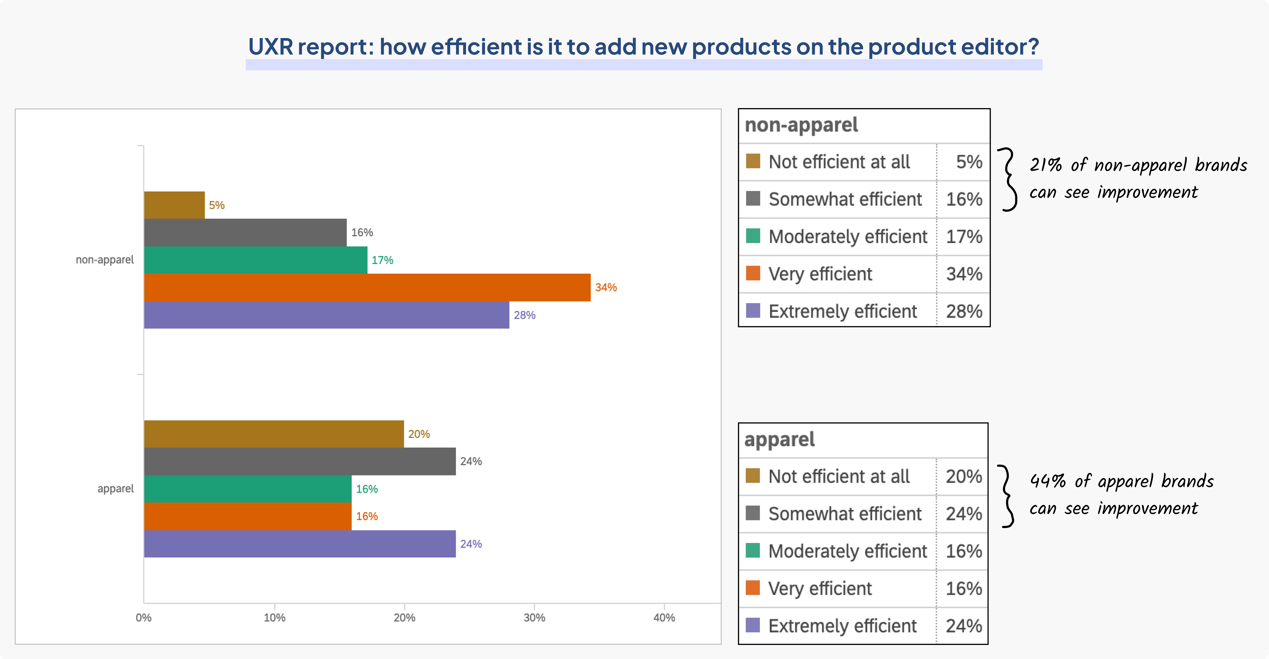
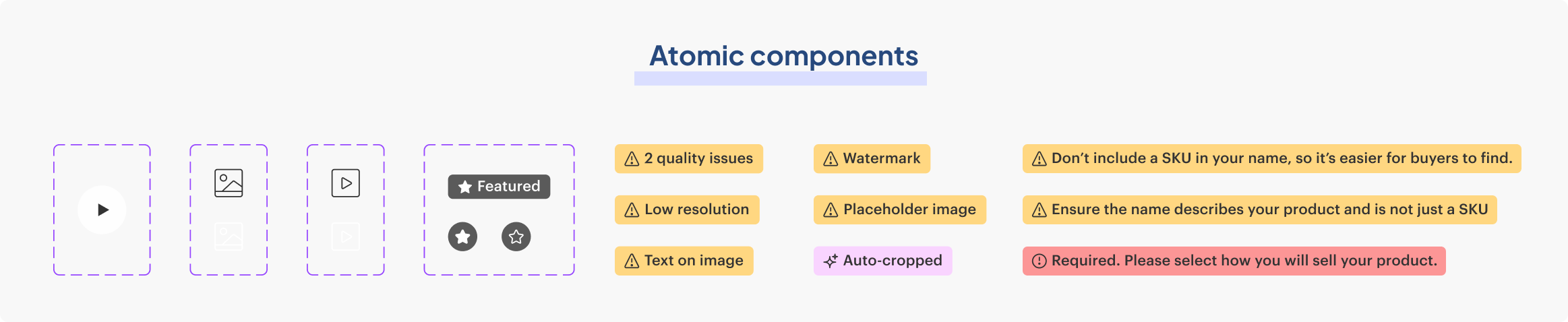
In the old image and video modules, there was a lack of importance placed on the featured image (thumbnail photo that appears on marketplace), which is the most important image to clear of listing quality issues. Through Hotjar tests, users reported confusion between what the “detailed” images meant; the labels are ambiguous and there is no clear distinction between featured and “detail” images. 

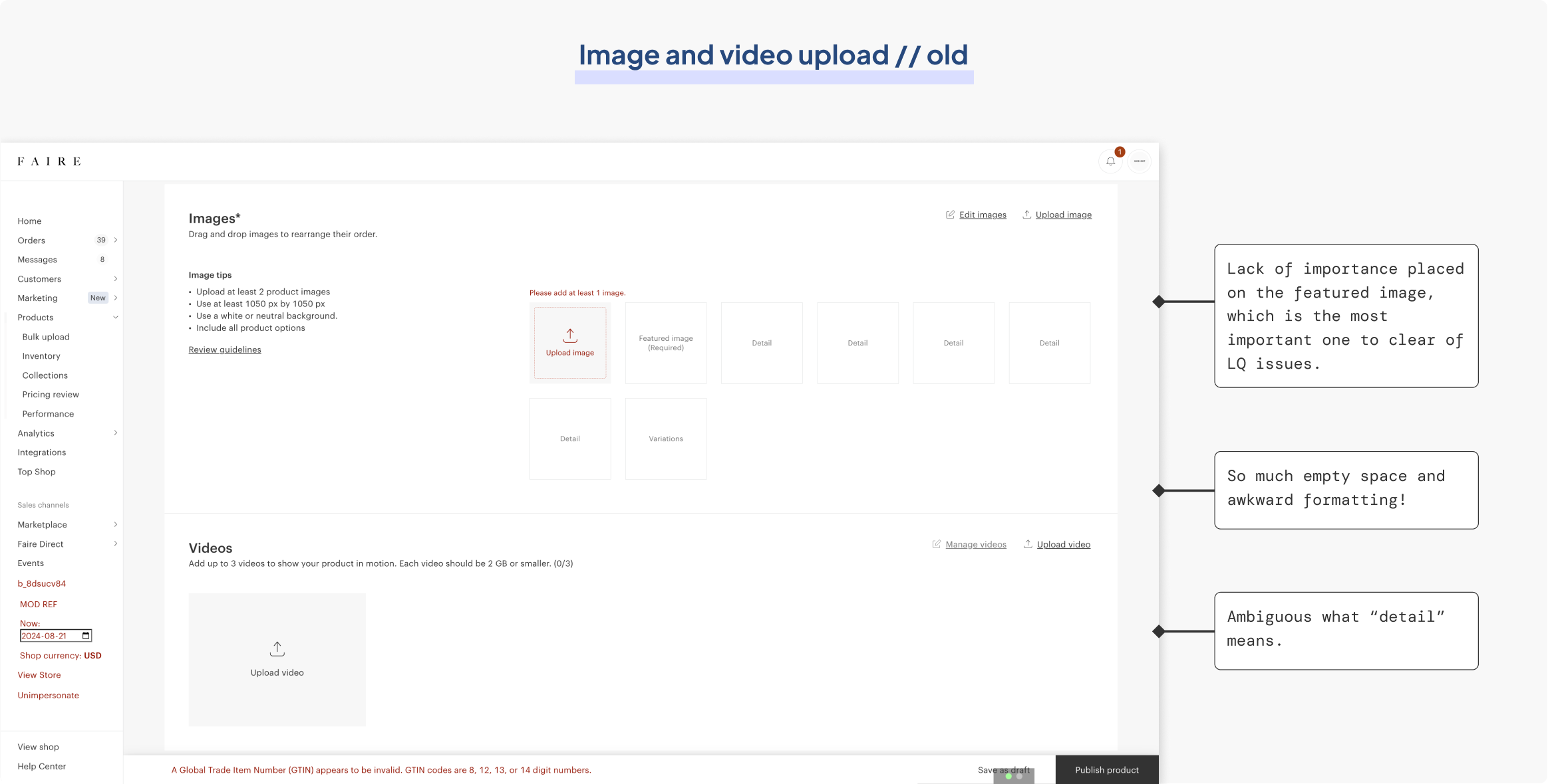
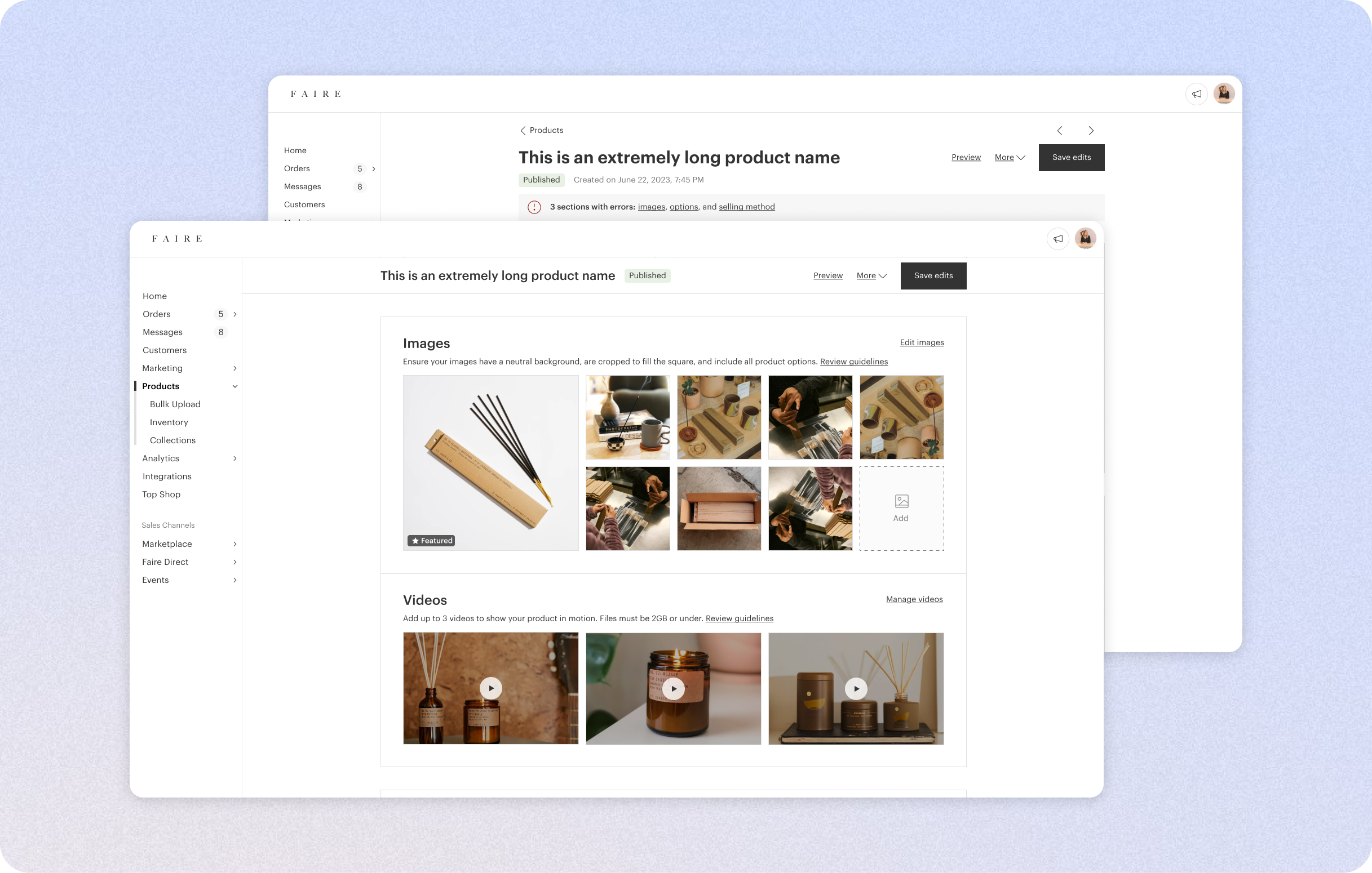
The product editor's old media upload module

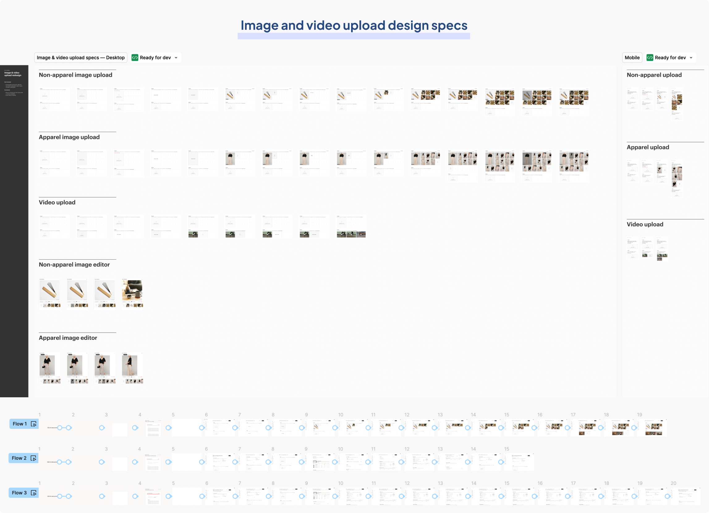
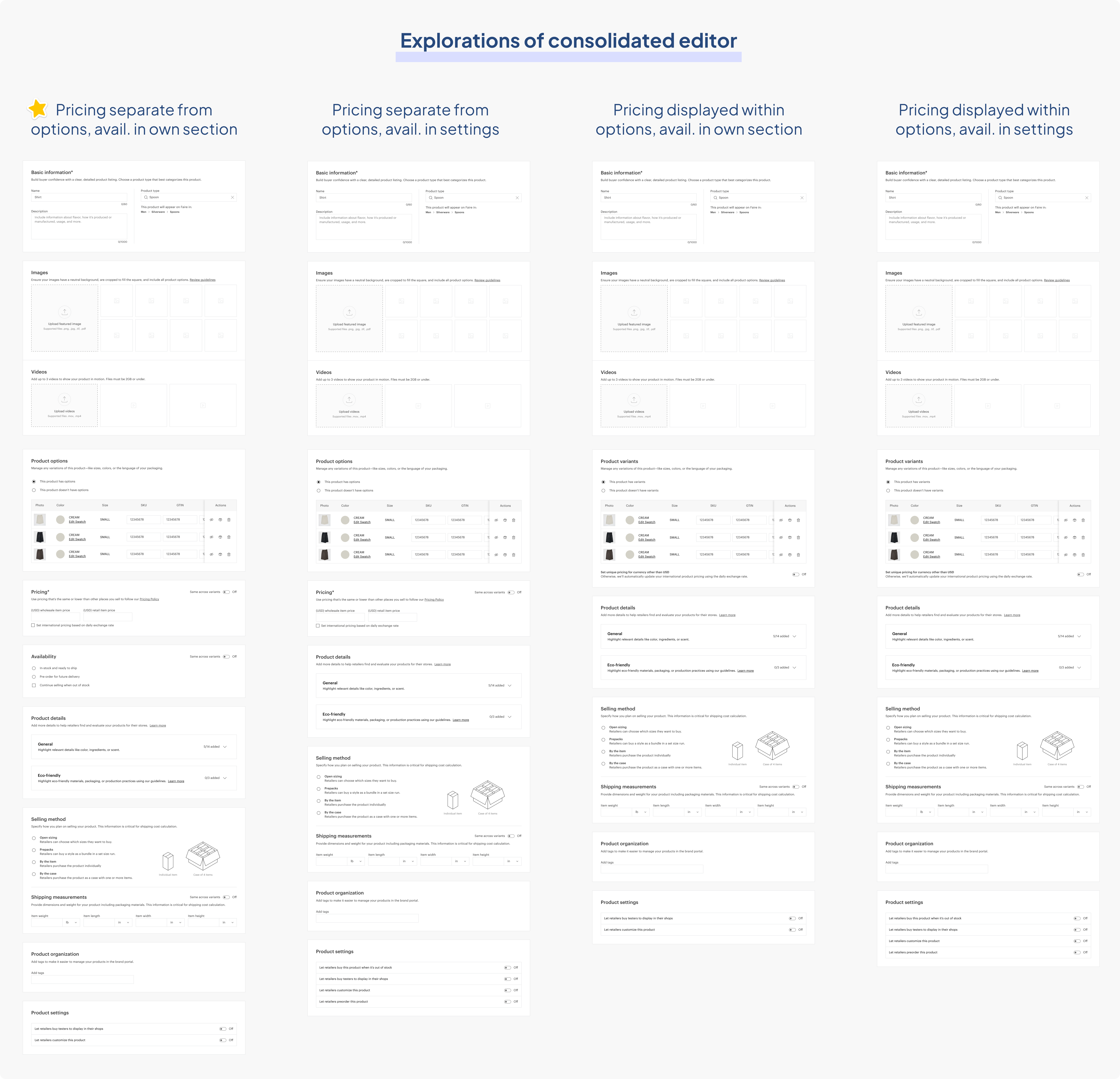
I explored four different layout variations for the image and video upload module, focusing on two key design decisions. The first decision was whether to combine images and videos or keep them separate, and the second was whether to use a single-column or two-column layout.

Exploring four different variations of uploading media

After reviewing funnel metrics, which showed that over 22% of brands included videos in their product listings, I decided not to merge the sections. The "videos" section was important enough to warrant its own dedicated space. I also chose to stick with a single-column format, as it aligned better with the new 1040 px container width. In the redesign, the thumbnail size is now increased to improve visual hierarchy. I also got rid of unnecessary text so the important text that prevents listing quality issues would stand out.

Thumbnail size increased and complete layout redesign

There is also a new version for apparel listings. Apparel photos are 3 by 4 in dimension, so instead of cropping these to fit a square frame, I made the frame itself 3 by 4 in dimension.

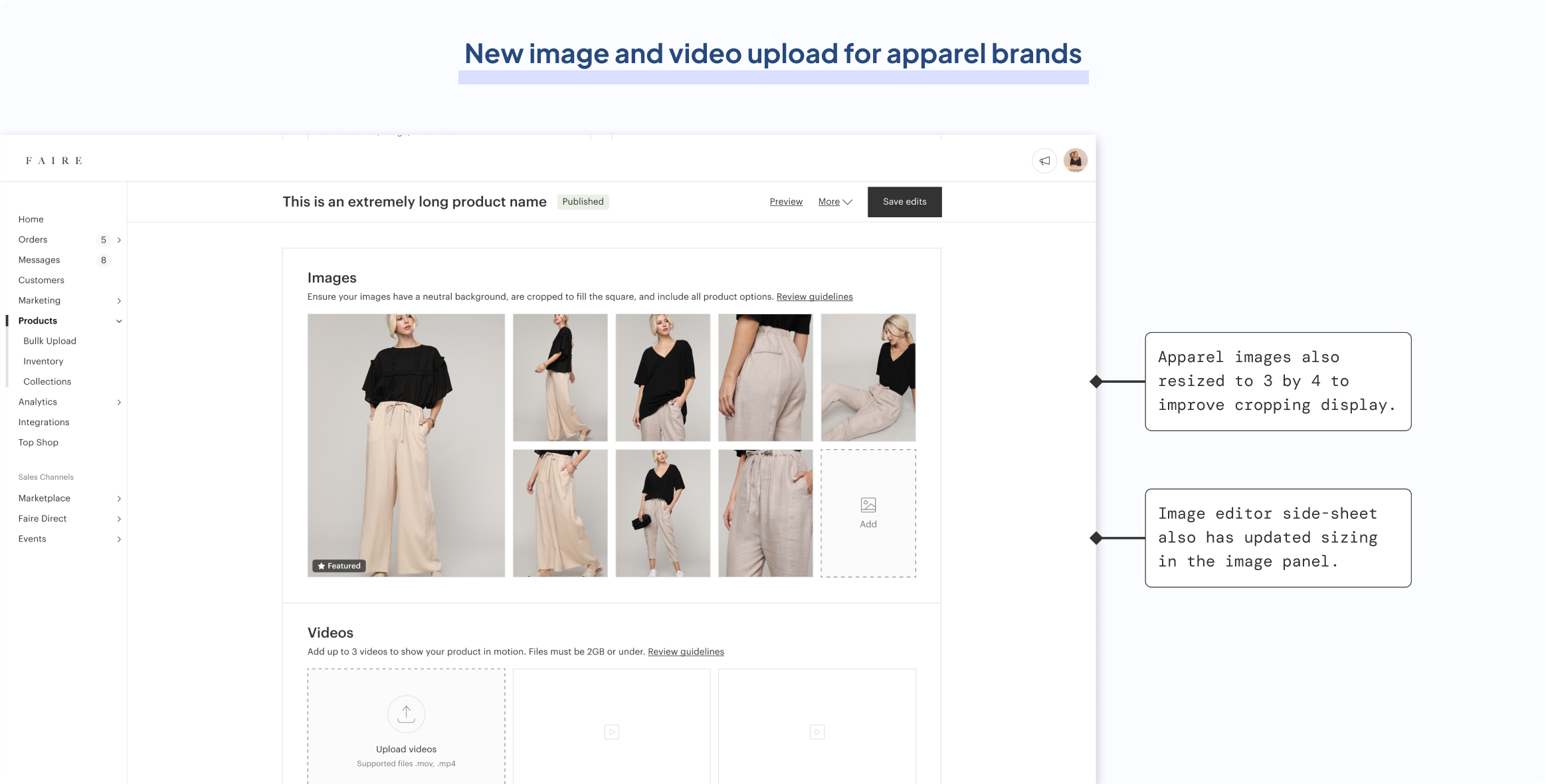
Apparel image frames changed to fit its natural 3 by 4 sizing to avoid lousy cropping

Design specs and dev collaboration

At Faire, I regularly synced with the two front-end engineers (Leyao Zhang and Steven McConnomy) building my product on an ad-hoc basis to go over specs. They were spectacular at understanding my designs straight from the files, and I ensured to cover every possible variation that could exist. For instance, in the error banners specs, I covered possible translation difficulties where the banner could span more than one row in languages like German.

Handoff specs for error banners

The image and video upload module was very complex from an interactive standpoint. There are many drag states, hover states, and interactions involving various components that might not be clear for devs. I made sure to cover all permutations, and on top of that, also provide thorough prototypes to demonstrate intended actions.

Handoff specs for image and video upload

QA reviews

Over the course of this phase, I routinely created Jira tickets and created detailed QA files to fix bugs and clarify intended actions. I was able to do QA reviews before a change was live on staging, since I linked my Github account to explore each build first. This led to some of the fastest QA turnaround times at Faire. I categorized changes as either launch blocking or not launch blocking, and also ranked them by priority.

Documenting staging build versus intended design for QA reviews with engineers

SLATE UPDATES FROM PHASE 1
Design system library contributions
Dropzone components

From my work on the product editor, I formally built out dropzone components and frames of the image and video upload modules, incorporating Slate-standard auto-layout, naming conventions, and component properties (size, state, and type).

Slate contribution made on 08/21/24

Icons and atomic components

Additionally, I designed smaller, highly reusable components for use across Faire, including a video icon for the Slate icon library and a play button for future video designs. I also created badge components that function as labels, which were immediately reused for listing quality alerts by another lead designer, Nick Howland.

Slate contribution made on 08/21/24 with branches built off my components

PHASE 2
The architectural problem
The apparel and non-apparel product editors

Faire’s single product editor is classified into two very different versions: one for apparel products (e.g. hats, shirts) and one for non-apparel products (e.g. books, silverware). The main reason for there being two versions is that apparel products usually have more variants and packaging methods, and they also need different photo sizes and cropping techniques.

Comparing the structure of the non-apparel (blue) and apparel (red) editors, with and without variants

Consequently, Faire’s product editor was built from two separate codebases: one for the apparel version and one for the non-apparel version. It became expensive to support two different versions at once since multiple updates needed to be made for a single change to the tool. Engineers have reported this as the single most expensive tech debt issue in the brand portal. 

For Phase 2, my primary focus is merging the two variant-based product editors, which are for products that feature multiple versions of the same product (e.g., size or color variants). These listings represent the majority on Faire's marketplace.

Merging the editors to reduce eng debt

The goal was to consolidate the apparel and non-apparel product editors by applying the correct design changes so that they could be built from a single codebase with minimal differences between the two versions. I’m essentially merging two smaller trees into one bigger tree with more branches, with the tree being the codebase and the branches being the logic.

Determining the differences

To address this issue, I first analyzed all layout permutations in both the non-apparel and apparel editors. I reverse-engineered the user flow, as it was undocumented from Faire's early days. Many people (who were still at Faire or not at Faire anymore) worked on it but nobody had a clear answer or firm grasp of the information architecture. 

Laying out every possible user flow between non-apparel (blue) and apparel (red) editors

By linking my GitHub account, I explored each repository and examined the underlying code to document all logic branches. I also impersonated test brands on Faire’s staging site to explore various inputs and outputs, capturing every possible permutation. I found that there were four distinct versions of the product editor: the apparel version with variants, the apparel version without variants, the non-apparel version with variants, and the non-apparel version without variants.

I placed these screens side-by-side to compare the non-apparel and apparel product editors, with and without variants.

Documenting key differences between non-apparel (blue) and apparel (red) versions

The defining differences between the two versions

 The non-apparel product editor displays pricing and shipping details (SKU) within the variant table, whereas the apparel version displays them in their own sections. Another key difference is where inventory details (availability) are displayed. The apparel version displays inventory details in its own section, whereas the non-apparel version displays it within product settings.

The final merge

In the apparel version, the current approach of dedicating an entire section to a single text box for SKU is an inefficient use of space. The layout feels so disproportionate that during a brand pillar design critique, several team members even questioned if it was a bug. Hence, in the consolidated editor, I placed SKU within the variant table which is how the non-apparel version does it currently.

Where to display pricing and inventory availability was a much more difficult decision. I drafted four variations for displaying pricing and availability, which I then shared during a design jam for feedback.

Exploring different formats of the merge

After jamming with one of Faire's design directors, I decided to place pricing and availability away in their own sections. This is part of a broader effort to simplify the product editor, as managing large tables had become unsustainable. These design changes will enable developers to merge the two editors, essentially cutting the engineering resources needed for the product editor by half.

FINAL DESIGNS
Faire's new product editor

Merged editor with new spacing, margins, and padding fixes to fit Slate guidelines (consolidated codebase)

New error handling system to quickly jump to listing issues

New image and video upload modules for Faire's product listings

Thanks for taking a peek  👀

Feel free to reach out!